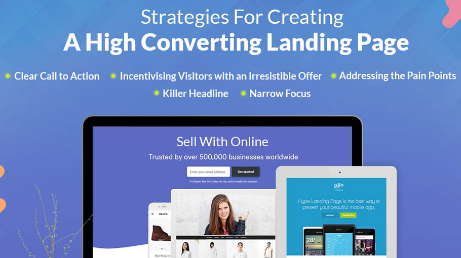
Creating High Converting Product Page
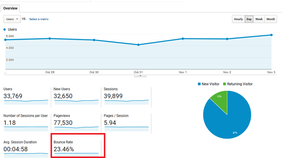
You have a great product that solves a pain point of the consumer. You have set-up a website to showcase and sell your products. Yet, something is not picking up. The bounce rates are not coming down. Well, one big reason for this could be the landing page you are directing your customer to. In this articles, we will see how can you create high converting product page, that can leave your competitors behind and improve your bounce rate.
Landing page/s is the window through which a customer peeks inside your world and if the view is not enticing there is a good chance they will turn away. Let’s understand what makes for a good and high converting product page/landing page, that can help you increase online conversion.
What is a Landing Page?
Any page of your website where the consumer is directed in order to initiate a conversation or take an action. Most marketers develop a new landing page for different campaigns keeping in mind the objective and the call to action.
Why a Landing Page is Required?
Given a specific campaign or target a landing page can have different goals. Few key benefits are:
- Creating the first impression
- Getting the consumer hooked with trusting elements
- Increasing the conversion rate
How to Create Landing Pages (High Converting Product Page) That Leave Your Competition Behind?
1) Bring in Testimonials
Research has shown that about 92% of people read a review online before making a purchase. However, many marketers have a separate landing page for testimonials itself. There couldn’t be a bigger mistake. Since testimonials are a big trigger in a consumer’s purchase cycle, they should be on every product page and wherever possible. But adding testimonials on product page can also make it high converting as visitors can get your customers reviews on same page.
2) Use High-Quality Images
It takes just 1/10th of a second to form an opinion about someone. The same is true about the websites too. According to a study done by Google, users prefer a website with low visual complexity and high prototypicality. One way to ensure that is by using high-quality images that can hold people’s attention. The closer the picture/images are to your offering the better effect it has.
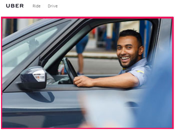
Uber shows you the face of a smiling driver the moment you land on their web-page. And another important thing about the image is that is not from any stock. Real authentic images boost trust and thereby conversion.
3) Limited Choice
In a world where a consumer is overworked shuffling through all the information and choices thrown at them, having a web-page that offers just what is needed is quite refreshing. You must aim at creating a landing page that eases the life of your consumer. Have a look at this page from Geico
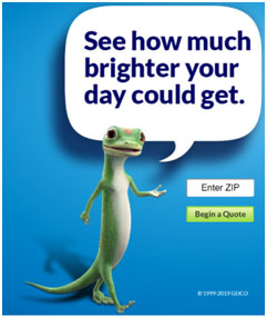
Having simplified landing pages leads to better conversions.
4) Don’t Make Them Scroll?
Long landing pages work well when you have long-form sales pages but when you have a certain goal in mind, asking your consumers to scroll down can be dissuading. Consumers respond well when they feel you value their time. Expecting a consumer to put in too much effort for your sake can lead to an increase in cart abandonment rate or might completely alienate the consumer. So, try and keep all the information on a single page in an easy to understand form. Look at the following pages:
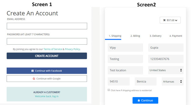
These pages are clear and concise in what they wish their consumers to do. Thus, ensuring that the consumer faces no difficulties in going through the process, as opposed to the page shown here:
A page where the consumer perceives that it requires a lot of time is a big deterrent in the completion of the transaction. To bump up your conversion rates, make your forms as concise as possible.
5) Add Video
Today, almost 1/3rd of all online activity involves people watching video content on various platforms. As a marketer, adding a video to your marketing tools can help boost conversion. With the increasing popularity of YouTube, Vimeo, Netflix, etc. revenue of online video platforms is due to a cross 800-million-dollar mark. Using a video on a landing page has several benefits:
- An engaging video can keep a consumer on your webpage for longer than usual time. This will give you a chance to send across your message
- A video tutorial/showcase of your product tends to create a connection with the consumer
- According to a study by Unbounce, people prefer watching a video over reading an article
Keeping a shorter video on the landing page can work wonders.
6) Define your CTA
No matter what you are offering your consumers, they wouldn’t be sure unless you have a clear and definitive call-to-action for them. It is imperative for you to tell your consumer what exactly you wish them to do once they land on your webpage. Highlight the CTA on your page and try to avoid cluttering the space. Too much information only confuses the consumer. Do a lot of testing to find out the best font, color, size of the box and placement position for your CTA button. As upfront and clear the CTA would, better will be the response.
7) Make it Mobile Friendly
With the proliferation of smartphones and high accessibility to data, people today prefer surfing via their phones than through their desktops or laptops. Keep in mind, while designing the landing page, that it is mobile friendly.
All your information is legible even on that small screen. The CTA is clear and in line of sight. It should not go under the fold. Check your pages on different resolution screens and a variety of handsets to chalk out any issues.
The Wrap Up
Creating a landing page is a mammoth task and it takes a lot of research to arrive at a proper design. Before you get down with a design pad, make sure you have all the information such as your aim, what is it that you wish to achieve, what you would like your consumer to do once they land on the page.
Once you have all the raw materials, figure out how to put them efficiently and cleanly. Do multiple rounds of testing and refining your page. The key is to never be satisfied and keep on improving. The results will follow.